
A dashboard can make an immediate impression through its spacing, typography and color. Turning that impression into a useful report requires a second step: separating the reusable visual language from the business structure that belongs to the original design.
For HYDRADATA’s CS03 production analysis demonstration, we studied a finance dashboard by Shakuro and developed a reusable set of Power BI design assets. A light-gray canvas, white modules and restrained lime highlights informed the visual direction. The production review question determined the page structure.
This article describes a design proposal. The accompanying templates have no business data bound to them and are not Power BI Desktop captures. CS03 uses original HYDRADATA synthetic sample data; it provides no evidence about an operating factory.
Portfolio demo | Synthetic data | Not client results
Démonstration de portfolio | Données synthétiques | Aucun résultat client
Study how the reference directs attention
The reference separates navigation, primary analysis and supporting business detail. White modules establish groups against a quiet background. Larger values and headings create hierarchy, while selective bright accents draw attention to selected content.
These choices are useful because they shape the reading experience: where someone enters the page, what they notice first and how they reach the detail.
Payment cards, transaction lists and a financial-health gauge serve the reference’s own context. Their presence is not a reason to add equivalent components to a production report. A gauge needs a defensible business meaning before it needs a place on the canvas.
We therefore separated surfaces, typography, spacing and selection states from the financial measures and workflows. The former became reusable design rules. The production question supplied a new analytical structure.
Let the business question determine the reading path
CS03 begins with a practical question: “When production falls short of plan, where should the review begin?”
Answering it requires comparison, then a narrower scope, then records that a person can verify. The two pages have distinct responsibilities.
Page one: compare, then narrow the scope
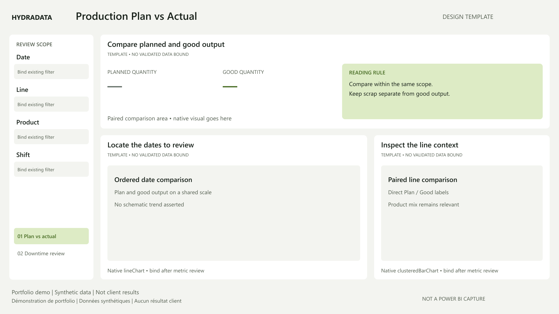
Production Plan vs Actual gives the main area to planned and good output within the same scope. Date and production-line views support the next step of investigation. Date, line, product and shift filters remain visible so the reader can see what the comparison includes.
The layout must respect the definitions. Actual output, good output and scrap are different quantities. Shorter labels must not blur that distinction. Products recorded in the same unit can still differ in production difficulty, so product mix remains relevant when interpreting quantities.
The template specifies paired labels and a shared-scale comparison. It contains no illustrative values and does not preselect a “worst-performing line” before evidence is available.
Page two: organize records for human follow-up
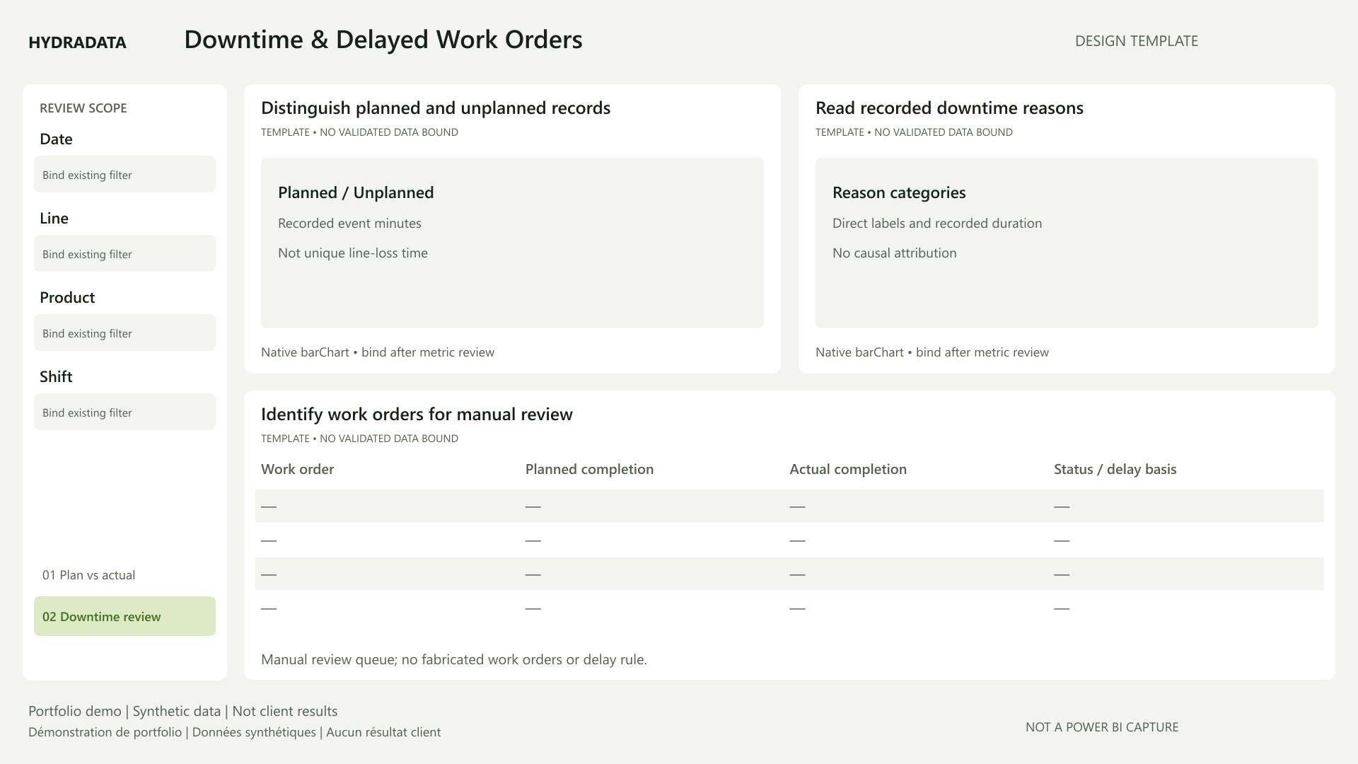
Downtime & Delayed Work Orders distinguishes planned from unplanned downtime, provides a view of recorded reasons, and reserves a wide area for work-order details.
The detail area supports the next conversation. Readers need to identify an order, inspect dates and status, and check the situation with the relevant colleagues. That job deserves enough horizontal space. It would be poorly served by copying the reference’s narrow transaction sidebar unchanged.
Downtime and delayed orders appearing together provide a reason to investigate; they do not establish causality. Recorded event duration is not automatically deduplicated line-loss time. A source Delayed status can also differ from a date-based delay calculation. The accepted business rules must govern those distinctions.
Give colors clear roles and keep labels explicit
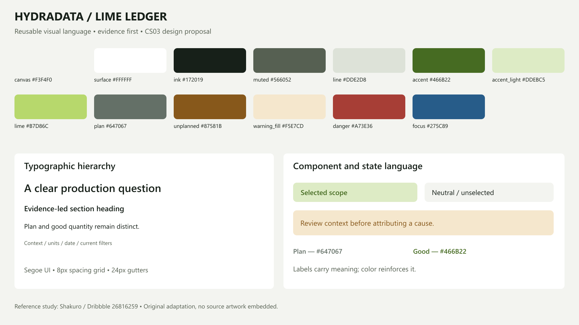
The adapted direction uses a light-gray canvas, white modules and dark text. Pale lime marks selected areas; a deeper olive green makes essential data marks easier to distinguish against white.
Plan uses a gray-green series color and good output uses deep olive, with explicit Plan and Good labels. Green identifies a series here; it does not mean that a target has been met. Unplanned downtime uses ochre with a text label, without implying that a record has been proven to cause a loss.
This approach keeps color consistent while retaining meaning in the words. Decorative boundaries can stay quiet. Text, essential marks and selection states need their own contrast checks.
Typography follows the same logic. The page title establishes the topic; section headings explain the analytical task; units, dates and filters provide context. Supporting text still needs to be readable at the intended viewing size.
Turn the design into assets that can be reviewed and reused
The deliverable is a set of working design assets:
- Design tokens record colors, type hierarchy, corner radii and spacing.
- A Power BI theme provides defaults for colors and selected visual formatting.
- Two SVG backgrounds and layout contracts describe surfaces, placement and reading order.
- Page story contracts identify the audience, question, evidence needs and intended human action.
- Component guidance and QA records explain usage and distinguish completed checks from outstanding ones.
Each asset has a limited responsibility. A theme cannot validate a measure. A background cannot implement navigation or filtering. A layout contract cannot replace the accepted semantic model. The templates leave the primary analytical message undiscovered until evidence supports it.
Review the path from the page to the next action
A useful design review asks whether the reader can identify the topic, locate the main comparison, understand the current scope and find records to check when something deserves attention.
These assets have passed theme-structure, selected color-contrast and static-preview checks. They remain a design proposal. Power BI Desktop import, data bindings, interactions and final visual acceptance have not been completed for this proposal. Its empty analytical regions make that boundary visible.
A reference helps a team discuss how a page should be read. The final structure still depends on the business question, available evidence and intended next action.
If you are reviewing a production or operations report, start with one question: what should its reader verify or decide after seeing this page? Discuss your reporting question with HYDRADATA.
Design reference: Shakuro — Finance Management Web Dashboard UI/UX Design. Article illustrations are HYDRADATA-created design templates. The reference artwork is not reproduced; no collaboration or endorsement is implied.